SaaS
6 min. read time
Agency Website Case Study
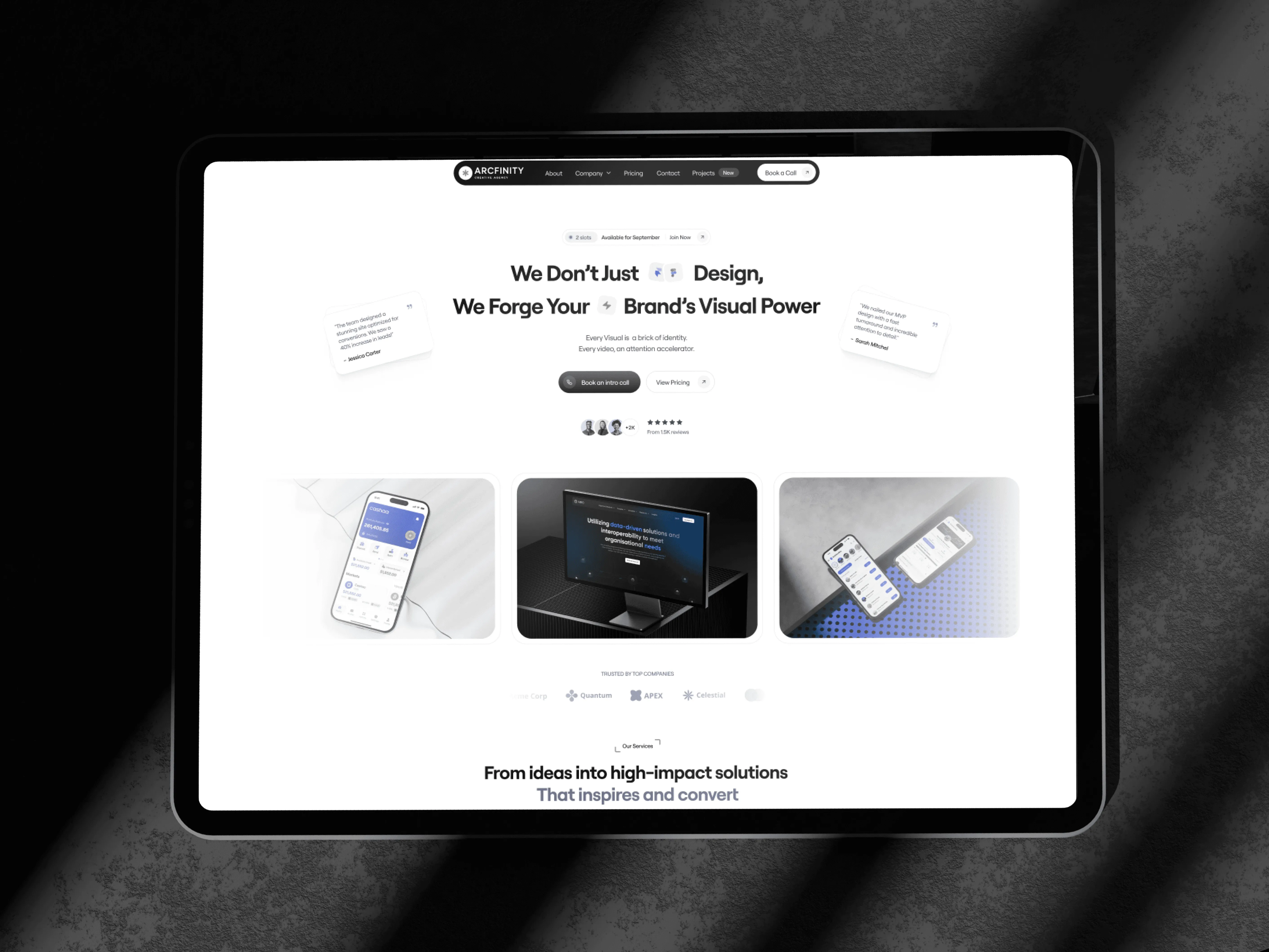
Product Designer • Website Design
Web • 1 Week
Marketing website • Responsive layouts
Project Overview
This project focuses on designing a modern agency website that clearly communicates value, builds trust, and guides users toward meaningful action.
The goal was to balance strong visual identity with clarity and conversion, creating a scalable foundation for long-term growth.
The Problem
Most agency websites look visually polished - but fail to clearly communicate value.
The challenge was to design an agency website that:
Instantly builds credibility
Explains how the agency helps businesses grow
Balances strong visuals with clarity and conversion
Feels modern, confident, and premium without being overwhelming
The goal wasn’t just to look good — it was to forge trust and intent within the first few scrolls.
Design Goal
Design a website that:
Positions the agency as a high-impact creative partner
Clearly communicates services, process, and results
Converts visitors into inquiries
Scales easily for future content and case studies
Design Approach
Strategy First, Visuals Second
Before designing screens, I focused on:
1.) Clear content hierarchy
2.) Conversion-driven layout
3.) Logical storytelling across sections
Each section answers one key question:
Who are you? → What do you do? → How do you do it? → Why should I trust you? → How do I contact you?
Clear Narrative Structure
The website follows a simple but effective flow:
1.) Hero Section – Strong positioning statement + confidence
2.) What We Do – Services explained with clarity
3.) Work & Results – Proof over promises
4.) Process – Transparency builds trust
5.) Pricing – Removes hesitation early
6.) FAQs & CTA – Reduces friction, encourages action
This ensures users never feel lost or overloaded.
Visual Design System
I followed a modular, iterative approach - balancing technical feasibility with user intuition.
Typography
▸ Clean, modern sans-serif for clarity and scalability
▸ Strong hierarchy using size, weight, and spacing
▸ Headlines designed to feel confident, not loud
Color & Contrast
▸ Neutral base to keep the experience professional
▸ Accent colors used intentionally for: CTAs, Key metrics, Important highlights
This keeps attention focused where it matters.
Color & Contrast
▸ Consistent grid system across all sections
▸ Modular cards for services, results, and pricing
▸ Designed for easy future expansion
Whitespace is used deliberately to improve readability and premium feel.


Key Sections Breakdown
A structured overview of the website’s core sections, highlighting design intent, layout decisions, and the role each section plays in the overall user journey.

Hero Section - First Impression & Positioning
Sets the visual tone and communicates the agency’s core value within the first viewport, helping users quickly understand relevance and build initial trust.

Services Section - Clarity & Scope
Organizes key offerings into a scannable structure, allowing users to easily grasp capabilities, focus areas, and how the agency can help without cognitive overload.

Work Showcase - Proof Over Promises
Highlights selected projects to demonstrate real-world application, visual quality, and problem-solving approach - reinforcing credibility through actual outcomes.

Process Section - Transparency & Trust
Breaks the workflow into clear, sequential steps to set expectations, reduce uncertainty, and show a structured approach behind the creative execution.

Results & Social Proof - Credibility Building
Uses metrics and testimonials to validate impact, helping users associate the agency’s work with measurable business growth and reliability.

Pricing & CTA - Decision Confidence
Combines transparent pricing with strategically placed calls-to-action to reduce friction and guide users toward inquiry at moments of high intent.
Website Showcase
Key screens showcasing visual direction, layout structure, and design intent.

UX Decisions & Trade-offs
▸ Clear CTAs without being aggressive
▸ Sticky mental model - users always know where they are
▸ Reduced cognitive load through spacing and hierarchy
▸ Mobile-first thinking to ensure responsiveness
Every decision supports clarity, trust, and conversion.
Final Outcome
The website demonstrates how a modern agency presence can balance clarity, aesthetics, and conversion without overwhelming the user.
Instead of adding visual noise, the design delivers:


The result is a website experience that feels clear, confident, and purpose-driven - designed to scale with the agency.
Final Thoughts

Good design isn’t about decoration - it’s about direction.
A well-designed agency website doesn’t just look confident. It makes the visitor feel confident in choosing you.